Swipe Party
When trying to understand the dating needs of our biggest growing segment of users (Gen-Z women) we wanted to be sure we were creating features that would speak to how they date today. Through research, we quickly learned that this demographic consistently used dating apps with their friends, in groups. They literally handed their phones over to their friends and would say “Swipe for me”.
This insight, coupled with the fact that we were in the middle of a global pandemic, brought us to the question “How can we offer users a way to date with their friends in the virtual world?”
ENTRY POINT
ADD FRIENDS
REACTIONS
SWIPE
MATCH
Swipe Party gave users the ability to have a group dating experience by inviting their friends to a video group chat enabling participants to enjoy the swiping experience together.
Because this was such a huge undertaking, the team was able to use an Agile Spike method to properly estimate our project and bring it to completion. Read more about Swipe Party here and view the prototype below.
View Prototype Here
Vision
Tinder 2.0
Social media has fundamentally changed since 2012, the year Tinder was launched. At the time, Tinder was at the forefront of social media - a mobile native, location-driven experience designed to enable people to connect via their photos. Today, social media has evolved. Video and Stories have replaced photos as the primary means of expression, and people are increasingly choosing to interact with smaller sub-communities rather than their entire network at once.
We had an opportunity to ride the wave of these changes and innovate new ways for people to discover each other and connect.
For 5 weeks a small, dedicated team of designers, product managers, engineers and data analysts got together and used this process to create a new vision for Tinder: Tinder 2.0.
V1
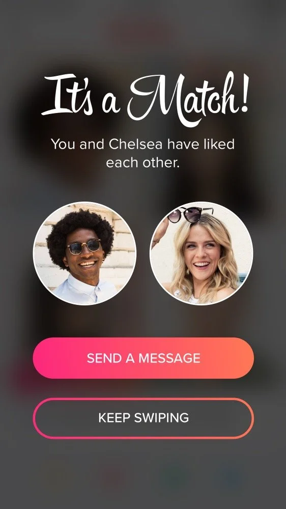
It’s A Match
Redesign
Old
When Tinder exploded on the scene in 2012, the “It’s A Match” screen quickly became part of the iconic brand’s image. This page was synonymous with the excitement and joy that Tinder brought to the dating world: Someone like me back!
But after years of the same image appearing again and again on hundreds of thousands of phones, it started to become dated and the excitement of making a match began to dwindle. Additionally, users were not using the send message functionality from this page creating a large time gap between matching and sending/receiving messages.
We knew we had an opportunity to update this iconic page and to not only bring some of that excitement back but also to use this page as an opportunity to give an overview of a users photos and encourage more first time messages.
Results
• First messages sent up by 10% of Day 0.
• Female first messages sent up by 16%.
• Male first messages sent up by 6%.
Loops
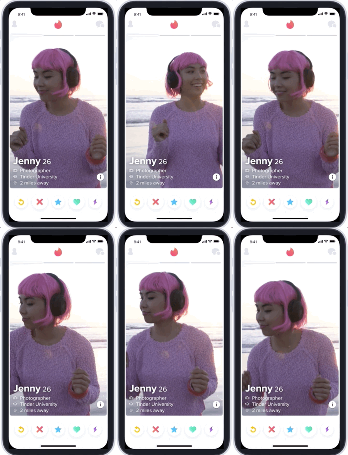
In 2018, video was exploding in social media. Competitor dating apps had been introducing long-form video features but through research we found that, without constraints, users did not know what to say and often felt intimated to upload content (especially in a dating context.) In fact, some of the videos were seen as awkward and off-putting. Additionally, we needed a way to ease into video to accommodate the efforts of our scaling Trust & Safety team.
As Tinder’s introductory video product, we wanted to to give users the ability to upload short-form videos to their profile. This allowed users to create more robust profile cards and helped members stand out from the crowd while giving them the ability to express mannerisms and personality. Read more about it here.
““With the addition of video, users have a new way to express themselves while also gaining key insights into the lives of potential matches. Whether it’s dancing at a concert, doing cartwheels on the beach, or clinking glasses with friends, Loops makes profiles come alive. “”
Results
• Loops profiles received 10% more right swipes.
• Users who added a loop experienced a 20% increase in conversation length.
Flow
Initial State
Tinder Feed
In an effort to increase engagement and conversations for existing matches, we introduced Feed. Feed brings your matches to life by delivering a visual and interactive experience that helps you spark conversation with the people you want to meet most. It’s an exciting new way to see more of what someone is all about by giving you a true glimpse into their world—their passions, their personality, their latest adventure—all leading to better conversations and deeper connections.
V1
Version 1 gave users the ability to message on items like a new photo or new Spotify anthem.
We continued to ask the question “How we can we make it even easier for users to send 1st messages?” Insight from users told us that quick reactions could help start a conversation in an easy and fun way. Mapping out our long term and short term goals as a team helped us figure out the best strategy to move forward.
Feedback
Contextual Messaging
Selection
V4 and Beyond…
As our vision for Feed grew, we began to understand that we had the capability to create a true discovery tool for our users. The idea that “Every Match Matters” became our north star and we continued to ideate on how we could use Feed to increase retention, engagement and bring new life into the app. Using data we collected like location, recency in the app and 3rd party partners we could resurrect life back into old matches and possibly up-sell users on our Premium features.
Message List
Success
V2
We wanted to add more opportunities for users to message. Adding changes in bio, updating school and work info gave users additional context for easier messaging and added content to the feed for scrollability. Overall, this helped to resurrect old matches that one would often overlook. I took the opportunity here to add vibrance through color and text.
V3 (Reactions)
Management Projects
IC Projects
Loops
Referrals
User Reporting
Reactions
Tinder Feed
Onboarding
Chat


